
With the transfer of Presidential power comes a transfer of ownership of who runs whitehouse.gov. As you might expect based on their difference in political philosophies, the two administrations have different approaches to the site. Comparing a few aspects of the two offers some reminders about how choices we make in content and design speak volumes about our priorities.
Navigation
Trump’s top navigation (from January 19, 2021) showed what he thought was important: economy, security, budget, and immigration — very specific. The site uses the expanding nav on left for more generic labels such as news, issues, and administration.

Trump’s top nav
Biden’s top nav (from Feb. 5, 2021) opts for more general labels: administration, priorities, and briefing room — except for COVID-19. The Biden site also offers a Spanish version of the entire site; there was no translated version of Trump’s whitehouse.gov.

Biden’s top nav
News
Both sites feature news prominently on the home page, but Trump’s headlines are much more visual and written in a vivid language.

Trump’s new feed
Biden’s news section mostly lacks images and the headlines are very straightforward.

Biden’s news feed
Accessibility
Biden’s whitehouse.gov, in addition to having a Spanish version, features controls for high contrast (changes the background to black and adjusts the text color accordingly) and to switch to large text size. Trump’s site offered neither of these.
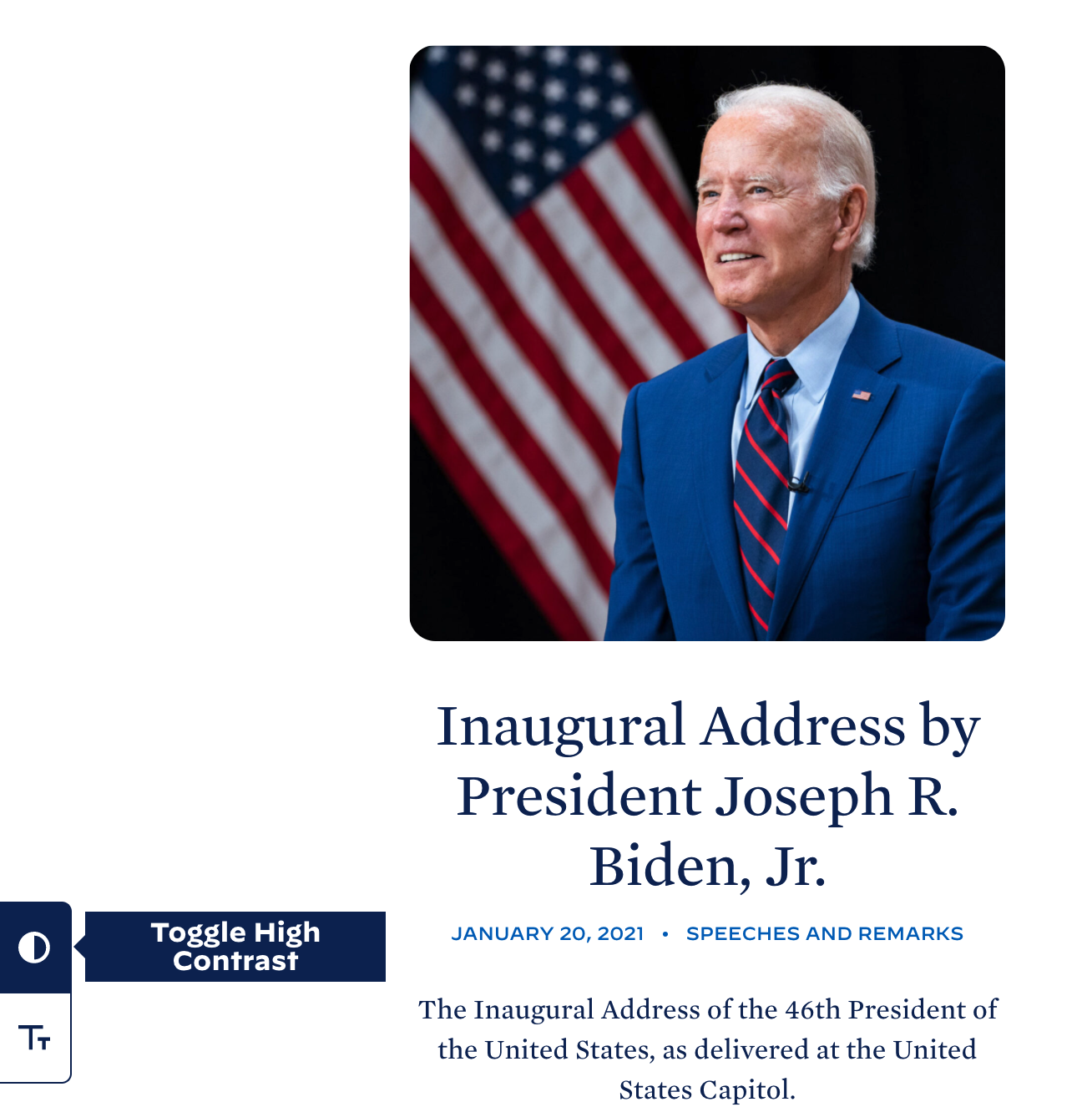
Contrast toggle on Biden’s site
Choices Show Priorities
- Trump’s approach to the navigation and news is more engaging. Visitors to the site are immediately presented with topics in the nav that matter to them. The news images and headlines draw you in. That makes sense since he used his online platforms to speak direct to his core audience, rather than rely on the news media.
- Biden’s site seeks to be inclusive. In keeping with his policies and style of governing, Biden wants everyone visiting the site to have access to the information, whether that’s through translating the information or offering accessibility features.
Be a Unifier
Politics in the U.S. may be divisive right now, but your approach to your site doesn’t have to be: take the best of both approaches.
- Use nav labels that match the tasks and topics that visitors are looking for.
- Use images and descriptive headlines to draw in readers.
- Make your site accessible to the most people possible.
Need help with your content strategy to better meet the needs of your users? We’re here to help.