
3D elements. Kinetic typography. Dynamic cursors. Today’s web design trends aim to wow visitors with vibrant visuals and unique aesthetics. When used well, they can strengthen your brand and set you apart from competitors.
But if you’re in higher education, you know that what’s good for a tech startup or advertising agency might not be good for you.
The following web trends may not be flashy, but they are reliable and effective. Use them to help you balance modern design with a sense of professionalism and credibility.
#1: Beautiful background video with user controls
Prospective students need to see what your school looks like and get a true sense of the student experience at your institution. Video can offer a dynamic way to showcase campus life, facilities, and the vibrant community that sets your school apart.
Allowing visitors to manage their interaction with your video — with features such as a pause or mute button — ensures accessibility and engagement.
Swarthmore does this well in its background video. A pause button in the lower right corner allows visitors to start and stop the video.
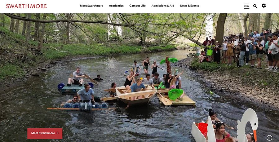
The text overlay disappears after a few seconds so visitors can focus on the moving images in front of them, distraction-free. What remains is a discreet and simple call to action: Meet Swarthmore.
#2: Full-width elements in body content
When an element takes up the entire width of a webpage, it can make a strong visual impact. It helps keep visitors focused on the content — which is why full-width elements are especially useful for highlighting key information.
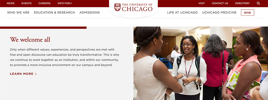
The University of Chicago’s website uses browser-width elements, contributing to a clean and uncluttered design that is visually appealing and easy to navigate.
Full-width designs can also adapt well to different device sizes.
#3: Appropriate animation
Animation is a broad term that encompasses everything from interactive scrolling to microinteractions. For industries such as e-commerce and marketing, animation signals a creative, forward-thinking ethos.
For a higher ed website, though, bold or excessive animation is distracting. The key is to use subtle animation, which can help you stand out for all the right reasons.
The following elements can engage your visitors without overwhelming them:
- Scroll-reactive animation, such as parallax scrolling
- On-load animation, such as fade-ins
- Hover animation or effects
There are countless examples of higher ed websites using animation well (particularly hover effects), but Northeastern’s is one that stands out.
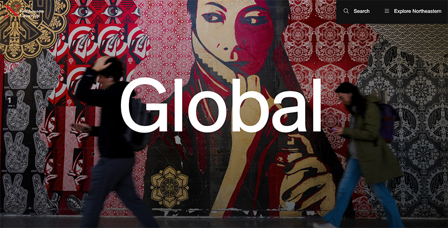
As its homepage loads, visitors are greeted with a series of one-word headlines that fade in gradually: Experience. Research. Global. The eye is drawn to each image that subtly zooms in and out.
#4: Browser-height heroes
A browser-height hero section immediately captures visitors’ attention and sets the tone for the rest of the website.
Like many of these web trends, it minimizes distractions by presenting a focused, uncluttered area that highlights the most important message or visual (this especially true when minimal text is used or when the text is static).
Muhlenberg College takes advantage of important real estate by engaging users with visually appealing content.
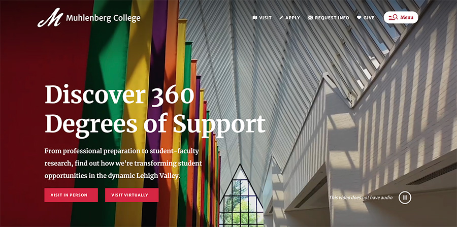
The calls-to-action (“Visit in Person”; “Visit Virtually”) are strategically placed to encourage students to take the next step.
#5: Modern navigation
Modern navigation improves the user experience and contributes to the overall functionality and aesthetics of a site. Two examples of this are:
- Sticky navigation, which keeps the main menu visible at all times as users scroll through the page
- A hamburger menu, a space-saving design that hides the navigation links behind a simple icon
William & Mary’s hamburger menu helps keep the homepage uncluttered.
It opens up a robust navigation panel with a search function, high-level pages, and links to popular topics.
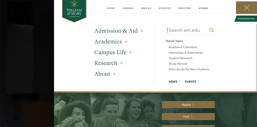
A hamburger menu adapts well to both desktop and mobile screen, providing a consistent user experience regardless of the device being used. Which brings us to #6…
#6: Smart mobile features
To create an optimal mobile experience, your website should be more than simply responsive. It should feature:
- Fast-loading content
- Mobile-friendly navigation, including an easy way to get to the top of page, through a “Back to Top” button or arrow or similar element
- Touch-friendly design, ensuring that buttons and links are large enough to be easily tapped with a finger
- Readable content, avoiding heavy chunks of text and making sure the font is large enough to be read without zooming
- Simplified forms, with appropriate input types for different fields
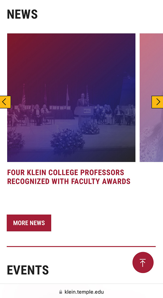
The website for Temple University’s Klein College of Media and Communication lets mobile visitors swipe through its news gallery; an arrow in the lower right corner lets you easily navigate to the top of the page.
#7: Easy giving
Modern higher education websites make it easy for people to make a gift to the institution. At a basic level, this means making sure the link appears on every page and is easy to find.
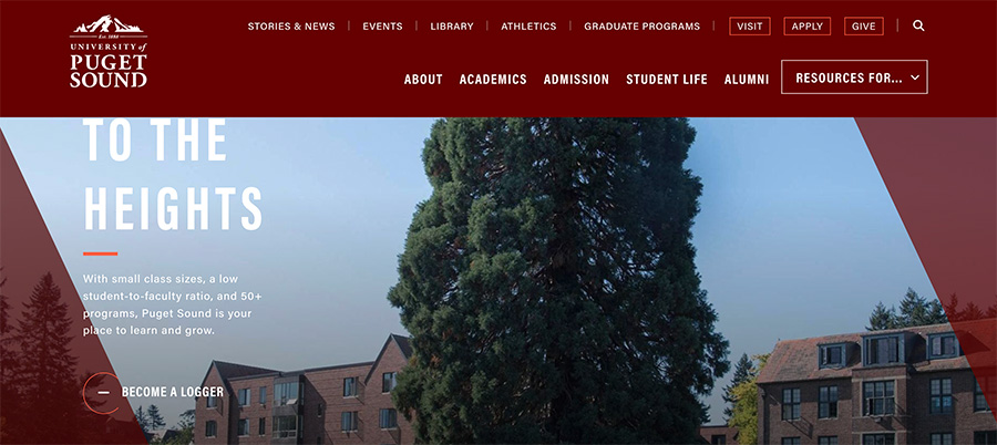
The website for the University of Puget Sound, for example, displays a Give button in the upper right corner alongside Visit and Apply.
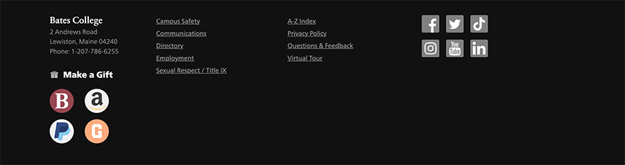
Bates prioritizes this call-to-action in a way that is especially user-centric: It’s displayed in the footer, offering visitors four common options for making a gift.
#8: Gradients and vibrant colors
Bold colors are in style across industries. Tapping into this trend can help you differentiate your brand and convey innovation and creativity.
Gradients add depth and visual appeal, encouraging prospective students to explore further. When done well, the use of vibrant colors can:
- Connect with visitors emotionally
- Improve readability and navigation, making information more accessible
- Enhance the overall user experience
Emory University School of Medicine makes good use of its brand colors to create a website that is visually striking and memorable.
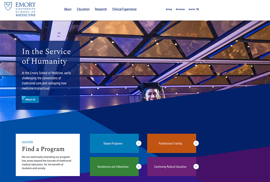
The website uses contrasting colors, such as the light blue and green boxes against the darker background, to enhance readability and draw attention to key areas like “Find a Program” and other call-to-action buttons.
#9: Standout multimedia
It’s a given that you should be using high-quality images, video, and audio on your site, but taking it one step further by displaying unique or unexpected assets will help leave a lasting impression.
Take this video from Vassar, for example.
Countless college marketing videos follow the same recipe: drone footage, a cinematic score, talking head interviews, and scenes of students in a lecture hall. From the first few seconds of Vassar’s video, it’s clear they’re not going that route.
If you’re a prospective student watching dozens of college videos, how many of the formulaic ones will you watch through the end? And more importantly, which ones will you actually remember?
Others ways to use multimedia to stand out from the competition include:
- Offering 360-degree interactive virtual tours (see Yale)
- Embedding social media content on the homepage (see Indiana State)
#10: Accessibility
Accessibility ensures that websites can be used by people of all abilities. For higher education, an accessible website is crucial to ensure that your visitors (including those with visual, auditory, or motor impairments) can access essential resources and information.
Aside from being the right thing to do, it’s also a legal requirement: Websites that are not compliant with the Americans with Disabilities Act can face lawsuits.
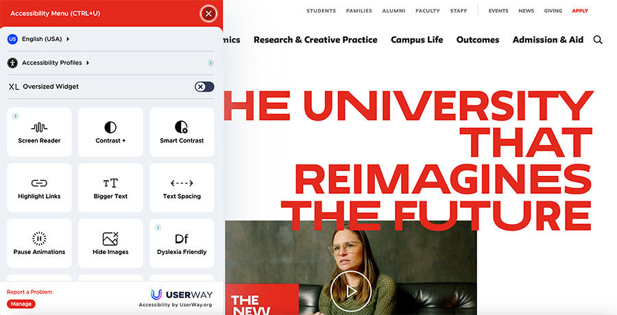
Offering accessibility options for specific audiences can help you meet this goal. The New School’s website features an accessibility button in the lower left corner, which opens up a menu designed to accommodate a wide range of accessibility needs:
- Screen Reader: Assists visually impaired users by reading out the text on the page
- Smart Contrast: Adjusts contrast dynamically based on the content, enhancing readability without over-brightening the screen
- Highlight Links: Emphasizes links on the page
- Pause Animations: Stops animations that can be distracting or triggering for certain users
- Dyslexia Friendly: Applies settings and fonts that are easier for users with dyslexia to read
Bonus trend: Regularly refreshed homepage content
Regularly updating the homepage with timely content is a popular trend among higher education websites. The benefit of this approach is threefold:
- Relevance: It keeps the content fresh and aligned with the interests and needs of current and prospective students, faculty, and visitors.
- Engagement: It can make the website more interactive and appealing to visitors, increasing user engagement.
- SEO: Regular content updates can improve search engine rankings.
(The content doesn’t create itself, of course. This approach requires dedicated resources to ensure the information is accurate, up-to-date, and reflective of your strategic goals.)
At the time of this writing (June), the University of Colorado Boulder is inviting users to explore local summer events and activities.
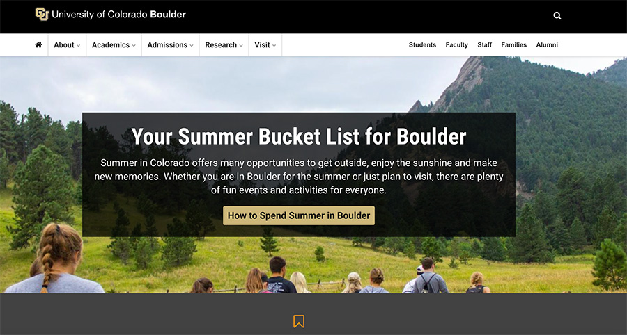
This kind of seasonal content improves user interaction and shows that the university understands and cares about its audience.
Web trends may come and go, but these understated strategies can help you captivate your audience in a way that’s authentic, measured, and on-brand.
Featured photo by Kylie Lugo on Unsplash