We recently completed a competitive analysis for a client, reviewing peer institutions to identify best practices that would inform a system-wide website redesign.
As we evaluated dozens of pages across multiple clinics, departments, and service lines, we saw a pattern familiar to many healthcare organizations: strong content and good intentions, but an inconsistent and underutilized visual strategy. Many of the websites we reviewed were for reputable academic medical centers doing truly groundbreaking work — but their visual content didn’t convey trust or cohesion.
Even when your written content is clear, engaging, and on-brand, mismatched or low-impact visuals can undermine it. When the visual experience falls short, the message itself can get lost.
The good news is that this is a solvable problem. Below are seven ways healthcare organizations can create a more polished, cohesive, and trustworthy digital experience through visual design.
#1: Brand consistency
To build trust, healthcare brands need to convey competence, reliability, and safety. When a site uses inconsistent logos, mismatched colors, outdated fonts, or half-coordinated graphics across its pages, viewers lose confidence.
To make your brand consistent, consider these principles:
- Use the same logo everywhere.
- Establish a unified color palette and stick to it.
- Adopt a core set of typefaces across the site.
- Standardize iconography, button styles, and page layouts.
When these elements work together, everything feels intentional, even before a user reads a single word.
#2: High-quality imagery
“High-quality” isn’t just about resolution — it’s also about specificity. The most effective images feel unmistakably tied to your organization, not interchangeable with those of any other health system.
Obviously, stock photography should be avoided, especially the generic, “smiling people in vaguely clinical rooms” kind. Users can spot it instantly, and it chips away at authenticity. Yes, sometimes it’s unavoidable. But when you rely on it heavily, your organization begins to look like any other.
A better strategy:
- If you don’t have an in-house photographer or videographer, hire someone for a single concentrated shoot — a half or full day. Capture a large variety of stills and B-roll. You can use this library all year.
- Show your people, your spaces, your patients (with permissions), and your work. A brief facility tour can make the experience feel tangible and real.
- Create consistent headshots. Healthcare organizations often have hundreds of providers and faculty members. Unified headshots — lighting, background, cropping — go a long way in making the site feel cohesive.
 Roper St. Francis Healthcare in South Carolina offers 360-degree ADA-compliant virtual tours of their hospitals. These give visitors a clear sense of the physical environment before they arrive, which can reinforce trust and reduce uncertainty.
#3: Clear navigation
Healthcare websites have more content than most industries. Without a clear visual hierarchy, it’s easy for users to get lost in the noise.
Good hierarchy means:
- Headings and subheadings follow predictable patterns.
- Buttons and links look like buttons and links.
- Important actions like “Find a Doctor,” “Schedule an Appointment,” and “Call Us” stand out visually.
- Fonts, spacing, and color contrasts guide the eye without overwhelming it.
When your hierarchy is cohesive, navigation feels intuitive, even before a user consciously interprets it. And intuitive navigation is one of the biggest predictors of patient conversion.
#4: Professional color and typography
Color and typography tell a story long before a user reaches the first paragraph.
Healthcare audiences tend to respond well to colors that signal trust: deep blues (which convey security and calm), green (health and healing), clean neutrals, and limited accent colors. Too many hues — or too many clashing hues — make a site feel chaotic.
Typography is equally powerful. A well-chosen type system:
- Creates consistency across departments
- Improves readability on mobile (where most users now land first)
- Reinforces your brand personality, whether modern, warm, or academic
In general, the most reliable and readable options are:
- Sans-serif for body text (e.g., Open Sans, Lato, Roboto, Montserrat)
- Serif for headings (e.g., Garamond, Baskerville) for tradition and trust

Throughout its site, FirstHealth of the Carolinas relies on a limited palette of greens, gold accents, and neutral backgrounds (plus clean sans-serif typography and consistent iconography) to support clarity and consistency across service lines.
#5: Credentials and achievements
Badging, awards, and credentials can be powerful visual proof points — when used strategically.
A few best practices:
- Don’t overload a page with badges. Prioritize the ones your audience will actually recognize.
- Keep naming conventions consistent across the site.
- Use badges as supporting elements, not focal points.
- Link them to explanatory pages when helpful.
When presented with restraint, credentials enhance rather than distract.
#6: Minimalism
Healthcare content is inherently dense. That’s why minimalist design isn’t about aesthetics; it’s about cognitive load.
White space gives users breathing room. Clean layouts reduce overwhelm. Fewer competing elements help people stay focused on what matters: understanding their health and figuring out what to do next.
For every visual element, ask:
- Does this help a user understand something?
- Does this guide them toward an action?
- Does it strengthen the brand?
If the answer is no, consider simplifying.
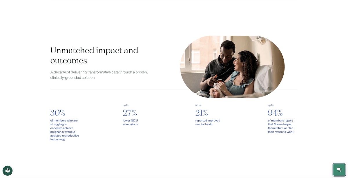
Maven Clinic uses white space, simple layouts, and a small set of visual focal points to present complex information in an intentional way.
#7: Authentic visual storytelling
Healthcare is human — your visuals should be, too. Authentic visual storytelling can be as simple as:
- Spotlighting real clinicians and staff
- Showing genuine moments of care
- Highlighting community programs and partnerships
- Incorporating imagery from research labs, classrooms, or outreach events
You don’t need sweeping cinematic videos or elaborate animations. You just need to show what your organization actually does — and who it is for.

By featuring real patients alongside concise, accessible storytelling, Pullman Regional Hospital in Washington state uses visual content to build credibility and emotional connection without overproduction.
A stronger visual strategy starts with intention
Great healthcare websites don’t just look good — they work well, communicate clearly, and tell a cohesive story of who you are and whom you serve. Contact us to learn more about how strong visuals can elevate your next project.